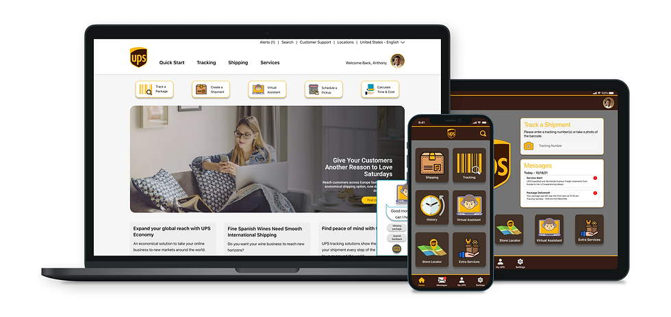
United Parcel Service Case Study
An updated redesign for UPS
United Parcel Service Mobile App and Website needed an upgrade. I listened to the users and happily came up with some ideas!
Disclaimer -
I’m not affiliated with UPS in any capacity, and the views for this case study are strictly my own. Since I don’t have full access to all the user data that influenced their current design, this case study is not fully comprehensive. This case study was done to enhance my learning experience and challenge myself to redesign it to serve a specific purpose.
What is United Parcel Service?
United Parcel Service. Inc. operates as a logistics and package delivery company that provides supply chain management services. Its services include transportation, distribution, contract logistics, ground freight, air freight, ocean freight, customers brokerage, insurance, and financing. The firm operates through the following segments: U.S. Domestic Package, International Package, and Supply Chain and Freight. The U.S. Domestic Package segment offers a full spectrum of U.S. domestic air and ground package transportation services. The International Package segment consists of small package operations in Europe, Asia Pacific, Canada, Latin America, the Indian subcontinent, the Middle East, and Africa and offers a selection of day and time-definite international shipping services. The Supply Chain & Freight consists of forwarding, truckload brokerage, logistics, UPS Freight, UPS Capital, and other businesses. The company was founded by James E. Casey and Claude Ryan on August 28, 1907, and is headquartered in Atlanta, GA.
Why this redesign?
When I was a kid, I would build computers for fun. For my birthday one year, my mom let me use her credit card to buy computer parts to build a new beast of a computer. I couldn't wait to play the latest games in the best quality without any lag. I ordered parts from Newegg.com - the shipping company was UPS. It was summer, so I didn't have to worry about school, so I woke up early and waited… Back then you had no idea when a package would arrive, you had some sort of tracking number and data, but you had no idea when the package would hit your doorstep. I must have been preoccupied, but I remember hearing that truck pull away, I ran out to see no packages, but the slip was on the door. I ran so fast down each block, hoping to see if the guy had another delivery. I got lucky that day and I spotted the truck up the hill from my apartment, the UPS guy knew who I was and said he would turn around and drop everything off for me. I was so happy! But during that walk back, I thought - imagine a day when you could know exactly where these trucks are? You could plan your day out around the delivery. But here I am in 2021 and for some reason - United Parcel Service isn't the friendliest or most updated courier service. I wanted to do a case study that really would help a company evolve to help their customers out a little more.
Goals and Motivations for the redesign
My goals for the redesign
-
To deliver an intuitive user experience and interface that lets the user have peace of mind that their package is safely on the way to be delivered.
-
Propose a more engaging and seamless experience when using the UPS service.
My personal goals
-
Take full ownership of the various roles involved in designing a product such as a User Researcher, User Experience Designer, and UI Designer.
-
Enhancing my learning experience by challenging some design decisions and addressing their solutions.
Project Scope
Desktop / Mobile Redesign
My Role
Tools
Figma, Balsamiq, OptimalSort, Usability Hub, Google Forms, Adobe Photoshop
UX/UI Designer
Duration
September 2021 - November 2021
Skills
Research, Personas, Task Analysis and Task Flows, Information Architecture, Wireframing, Prototyping, Usability Testing, UI Design
Design Process
As the user experience designer for this project, I was responsible for both strategies and visual design.


Market Research
I wanted to do some research into how UPS operates and how exactly the user experience is for me as a customer. I planned to first do a broad analysis of how their business operates and do a simple SWOT analysis. Then I needed to figure out who exactly uses UPS and why would they choose UPS over USPS, FedEx, or any of the major couriers. I also did a deep dive into each of the other companies, mainly focusing on Amazon. Amazon is the one company I have found that does it right. I included more of the competitive analysis research in two SWOT profiles for Amazon and FedEx - Link.
SWOT Analysis

Amazon's Delivery Service
In the last few years, Amazon has revamped how it delivers packages. It's everything I dreamed of - now this depends on where you live and if Amazon is using its own delivery trucks. But I have got to think it's a wise investment for courier companies to emulate this.

-
When you order anything from Amazon it will inform you via notifications that your package is shipped, in transit, and out for delivery.
-
You will receive a notification again when the package is less than 10 stops away.
-
Followed by delivery confirmation via picture.
-
They also have the ability for a driver to text/call you if they cannot find the location.
-
As well as the ability to add delivery instructions.
Checking the features
I had to check all the features, including the tracking information. So I figured I would have to send myself two packages on different dates. One for myself to do the research and one later for my interviewees to test how the app currently works. I'm glad I spent the money because I was blown away by how the tracking system works.

Mobile App Analysis
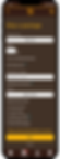
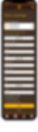
There are a lot of screens to go over, and I want to keep this review short and precise. My first thoughts are going by my interviews and the review section. This app is old-looking – there are so many issues to go over. One major thing I realized: the sitemap/user flows are all over the place – this will be the main focus moving forward. Feel free to click the image below to open a PDF showing the before screens.

-
The app seems outdated – a lot of the screens and buttons just seem too unfriendly.
-
The signup screens and login screens seem like a webpage. A lot of users are having issues signing in to their accounts – I would love to know why that happens (internal development issue).
-
The colors are fine, but I think it could be revamped a bit. My interviewees have said the colors are so off-putting, but it’s the brand colors. I think UPS realized this and introduced new colors when they started revamping how the stores look.
-
The hamburger menu needs too much work or functions need to be split into an inviting navigation bar.
-
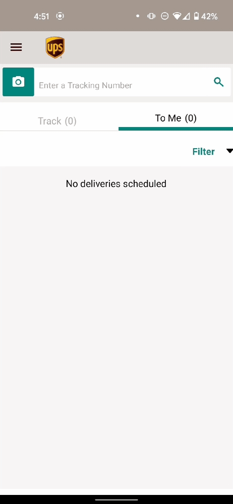
The main tracking page is very boring – If I have no packages tracked, it’s just an empty area. This is also the main page users see when they log in.
-
The shipping feature gets broken down into four parts. I would like to know if anyone uses the measuring tool. But the forms again make it seem like you could just use the website to do this.
-
Finding a location screen needs to be reworked as well. The following informational screens are not bad but can be innovated a bit.
-
The virtual assistant screen is outdated as well – I can feel like I am texting a bot. It doesn’t feel like a real person behind the text.
-
UPS MyChoice screen is another main focus right now. There are few options, and it seems like I need to pay a yearly fee for any other information.
-
Major UI changes are needed across all the screens – font, forms, buttons, everything.
-
The tracking information screens again feel like a webpage. Simple tables display shipping progress. No GPS location history either (paid feature).
Desktop Analysis
The desktop is more welcoming than the mobile app. It still is confusing at times and has its limitations. There are also a lot of screens that need to be updated.

-
There are so many screens within this one site that I could understand why it would be so confusing to navigate.
-
The homepage doesn't notify the user that they are logged in.
-
The header works for this layout because there is a ton of different links throughout the website.
-
The tracking doesn't feel updated, and it's straight to the point - but boring.
-
Most of the options for everything feel like it is also modeled to be used on a tablet in a store.
Analysis Takeaways
There is a lot of work that can be done for this! For this redesign - I want to focus more on the mobile app because I can test it in front of a store with real customers. But, I know the desktop needs a lot of work too, so I will design the most important screens for that as well - I will focus on the login, tracking history, and live GPS location tracking.
Understanding the Users
The real demographic information is tough to track down. I based my findings on judging the age of profile pictures on reviews, standing near my nearest UPS store, and through my survey results - the demographic is a wide range from around 13-95. Younger adults seem to use the app and website more, while anyone over 50-60 uses the services in the store. Almost everyone has to make a trip to send or return a package at the store.
Survey Results
I had a total of 28 responses for the survey I conducted. Doing a survey confirmed a lot of the research I had been doing. Users want key features that seem like they should exist already.
Sample Questions: Link
Key Takeaways
-
Most users use the website more than the app, but both are used more than the other methods.
-
Almost everyone is using online shopping, and they receive multiple packages per month.
-
They check the tracking information a few times per week, but it depends on the package.
-
Half of the participants do not have any courier apps installed on their phones.
-
The most requested features are package tracking, live GPS history, and live notifications.
-
Almost 85% of participants would like to receive live notifications via phone.
-
Half of the participants feel confused when using a courier's website.
Interview Results
I conducted a total of five interviews. The male interviewees’ age ranged from 19 to 45 years old, while all 3 females ranged from 20 to 72 years old. Interviews are always the best for me since I can gauge a participant's viewpoints on a topic - it was a mixture of in-person and remote interviews using Zoom.
Key Takeaways
-
It seems not one-sided with one company when shipping or receiving items, it depended on the location, ease, and service.
-
Almost everyone has used Amazon and their GPS live update notifications, and they believe all couriers should have service by now.
-
Most agree that the UPS mobile app and website feel outdated and need an upgrade.
-
Everyone agreed that UPS needs to upgrade its technology by using different means of notifying users, taking photos of successful deliveries, and GPS tracking.
Usability Testing: Desktop and Mobile App | Current Version
After the user interviews, I asked the same participants to test the mobile UPS App and the desktop client. I conducted both virtual and in-person usability testing. I wanted to see how they would interact with the features. I gave them four specific tasks using my account information. (I shipped a package to myself to assess the tracking capabilities)
-
Login to the account.
-
Enter the tracking information for the package.
-
Navigate to the GPS information.
-
Navigate to adding information or updated notes for the package.
Understanding the current users
As of 2021 - the UPS Mobile app is sitting at | 3.9 ⭐ | 71K Reviews | 10M+ Downloads
There is a staggering amount of five-star reviews that feel, not right. I went through all of the latest reviews based on the current version, from 1 to 4 stars. The following is a snippet of the reviews I read, I labeled each review into a category (Affinity Map).


Andy sums up the state of location tracking with UPS in one tweet for me though...
Demographics
Conducting a Survey and User Interviews
I started my user research by conducting a twenty-question survey to gather some basic quantitative information about courier services and the technology people really would love to have when they use a service. The next part was conducting user interviews with five users, who varied from entrepreneurs to the elderly, to understand how different users go about using the features on the website and mobile app.

Defining the Problem
I had to figure out some common pain points by using everything I had learned with the survey, interviews, and app review research. I started by combining all of the feedback, insights, and pain points and grouped them into categories. This helped me brainstorm and develop potential ideas and gave me a clearer view of what was important to the users while keeping in mind the business goals and objectives.
Affinity Map
Using the interview data I had to map out how the user thinks, feels and how to use UPS's services. I made an affinity map to help me categorize all the data. Now I can piece together pain points and devise a plan to make our users happier!

Pain Points
Pain Point 1 - Incomplete Mobile App
Many users would rather use the website to access more features not available on the mobile app. This can be addressed by giving them the top features that they would need. It might be possible to branch the app into two accounts – one is for the regular user and then a business account specifically for extra business-related features.
Pain Point 2 - Confusing or cluttered UI
Users have complained about the mobile app feeling boring or just useful for tracking a package and nothing else. Having a more aesthetically pleasing mobile experience might allow users to subscribe to a yearly service. As well as allowing features like live location tracking to be free, it will encourage users to keep the app installed on their phones.
Pain Point 3 - Poor tracking details
Tracking details are very plain and simple, straight to the point, but it cannot track a package via GPS. Users should be made aware of where their packages are at all times because they might have a busier schedule that day.
Pain Point 4 - Notifications
Users need to be informed of where a package is at each point in its shipping cycle. This allows them to schedule their time accordingly – this can be branched off into sending notifications to multiple devices as well.
Pain Point 5 - Update Package Delivery Instructions
A major request is the ability to talk to a driver – users have experienced theft because of drivers not following delivery instructions. Users have relied on hanging notes on the door to alert the driver that they are home and ready for delivery. Users should be allowed to update delivery instructions for each package that is being delivered. This will ensure a great customer experience.
Needs of the Users
For this redesign, I wanted to focus on three major needs of the user.
-
Tracking must have a way to track a package via GPS Live Location updates.
-
The user must be able to update a package's delivery instructions for each delivery.
-
Use the mobile app to send a package.
Thinking of the User
I love this part - it makes me think of writing stories about characters as a kid. I get to use all of that data and make a person who really would use UPS. Let's meet Anthony!
User Persona
I wanted to incorporate all the research I gathered by making our persona someone who would be using the mobile app more frequently than the average user. Doing this would ensure that through designing for someone who runs a small business, UPS might be able to gain more users - word of mouth and positive reviews of the mobile app and new features will spark an uptick in daily users.

User Journey
For Anthony - I needed him to be happy when receiving information about his incoming package. He runs a business and time is a major factor. So allowing Anthony to track a package and see the live location history is crucial to keep Anthony a loyal customer.


User Flows
For the user flows - I needed to think of how a user might use the mobile app to do three major tasks. I wanted to focus on the needs of the users and give them their most requested features.

Card Sort
Card sorting was done to categorize all the features under different sections, which will further help in organizing the information architecture. I chose to do a hybrid card sort with six participants. I presented the participants with multiple cards with the four navigational categories. The results gained from the card sort were overwhelmingly aligned with my plan.

Information Architecture
It seems like the best plan for the information architecture is to keep this app simple. It's very confusing for some users to navigate, and I think a navigation bar with four categories will work well.


Wireframes
Paper wireframe time! I love this part. I went through all the screens on both the mobile app and desktop of both UPS and its competitors. After making some observations, I sketched out all the possible layouts and finally came up with one that looked like it would put a smile on any user's face.
Paper Sketches


Mid-Fidelity Sketches

High Fidelity Redesign


UI Kit


Usability Testing
After I finished designing and prototyping my high fidelity mockup - I thought I would use a mixture of past interviewees, and new participants, and I even went out to my local UPS Store to do some guerilla testing.


Brenda is just getting used to using apps at this point in her life - she was nice enough to take the time and test out both the old mobile app and my redesign. This was her expression when she saw the new homepage!
Interested in viewing the prototype?
Lets have a little fun!
Google Nest Mini

Our user Anthony is cooking some chicken and his hands are covered in batter. With Google Nest Mini, Anthony simply has to ask Google if there are any updates with his packages.
Google Nest Hub

Anthony left his phone in another room, but he's walking by his Google Nest Hub. Google has the latest updates from UPS and displays a GPS location for Anthony.
Neuralink

If Elon Musk gets his way, and we end up with chips in our heads, we might never miss a package.
UPS Drone Delivery

I loved the idea of receiving packages anywhere. A user said during an interview, “Imagine getting a package anywhere without needing to be home? I'd pay extra for that service.” Well, I imagined what it would feel like. Anthony is on a camping trip and forgets to pack some cooking supplies. UPS TO THE RESCUE! In a few short hours, a drone could show up, notify Anthony via his phone and deliver to his nearest location.
Samsung TV

It's a Saturday and Anthony has the day off from work - he decides to play some games with his friends. He might miss that package because he has his headphones on and can't hear the notification on his phone, so Samsung and UPS have Anthony covered - a notification pops up on the bottom right of the screen.
One of the main problems users faced was the feeling that UPS was behind with how they receive notifications in today's world filled with electronics. I thought - why not design some features in popular devices but have a little fun with it.
What was the main challenge in this project?
I wanted to find a service we all use daily and revamp it a bit. I honestly wonder why the UPS app and website feel a bit outdated to this day. When using Amazon – I feel like the UX team has most of the issues figured out. One major thing I’ve wanted since I was a kid was to have updated live tracking on all my deliveries and to add notes to the account like “Please just throw my package behind the bush – do not return it to the warehouse.” I feel like users would love to have the experience of feeling like their package is safe from the second it's shipped to when it arrives at their doorstep.
Reflection and Lessons Learned
I am so happy I did this redesign - but throughout this cast study I thought, “UPS needs to innovate their business”. I think a lot of the issues they have with the app and website are based on their business model. Users shouldn't have to join UPS MyChoice and pay a yearly fee for the service they currently offer. All the changes I suggest here really come down to, “Will the business profit from these decisions?” - I think yes it will, but it will take a lot of work from everyone.
I had been thinking of what to redesign for months, and I have had this realization that I wanted to look back at the past and think of the wacky ideas I had growing up and possibly build some of them. Throughout my UX learning experience, I would randomly think of this project, and I’m happy I finally put it together. In that, I realized I was just building this for that young kid who was waiting for his computer parts to arrive that day.
Thank you for reading!
If you have any feedback or want to chat with me, drop me a message at KBrackenUX@gmail.com or connect on LinkedIn.