
Project Overview
With the emergence of technology in the last fifty years, the world of buying and selling has changed. We have shifted to a world where more transactions happen online without the need for cash, and now in the last few years with the innovation of the cell phone, there is less need for a physical bank card. We live in a world where the amount of online sales and transactions is skyrocketing every year, consumers have adopted different models of purchasing goods including subscription services.
We enjoy making online purchases for multiple reasons. From cost and convenience to security, and for a good amount of people we understand that our time is the most valuable resource - so people will be happy purchasing goods and services online for the foreseeable future.
But now we have to continue to innovate how we conduct business. This brings up many questions that need to be addressed. Can we trust a device and company to store our banking information? How can we continue to innovate this technology to be used wherever in the world? With the emergence of cryptocurrencies, will the world be using multiple forms of currency to buy and sell goods?
The Challenge
The user needs a way to be able to transfer and buy products and services easily as well as be able to add others who use multiple different apps, banking services, and currencies because as the world changes more to digital payments and currencies, users need a reliable app to be able to transfer and receive funds whenever they need to.
We will know this to be true when we see PlutoPay’s users can complete transactions between businesses and social contacts - as well as invest in different cryptocurrencies.
The Outcome
The first version of PlutoPay will allow the user to transfer and receive funds from their contacts, buy and sell cryptocurrency and send referral links to earn cash and rewards for inviting their friends to use PlutoPay. These features are the most important for growing the service and keeping the users engaged.
Design Process
Project Scope
Mobile Web App
My Role
Tools
Figma, Adobe XD, Balsamiq, OptimalSort, Usability Hub, Google Forms, Adobe Photoshop
UX/UI Designer
Duration
February 2021 - September 2021
Skills
Research, Personas, Task Analysis and Task Flows, Information Architecture, Wireframing, Prototyping, Usability Testing, UI Design
As the user experience designer for this project, I was responsible for both strategies and visual design.


Market Research
The first thing to do is to do research on the digital payment services market. This phase will help me understand what users are currently using in the market and who my target audience will be for PlutoPay's digital payment services. The best thing to do is set up some goals prior to doing any research.
Research Goals
-
Research the competition: I want to figure out how other companies operate.
-
Who is using digital payment services? Finding out the demographic and see if other companies are expanding into different markets.
-
Survey and interview participants to uncover vital decision-making data.
Consumer Trends
-
While digital methods, such as digital or mobile wallets, have become more common, the number of credit cards does not seem to be declining significantly. This is in part because these wallets use a credit or debit card to facilitate the transactions. As such, these payment methods are likely to remain common, at least in this capacity. The purely digital options, known as cryptocurrencies, are currently constrained by such factors as lack of governmental supervision or lengthy transaction times, keeping them from becoming more popular.
-
In 2023, near-field communications or other contactless technologies are projected to generate over 220 billion U.S. dollars in transaction value. As of 2018, about 25.3 percent of smartphone users in the United States were actively using proximity mobile payment services.
-
In 2020, digital/mobile wallets and credit cards were the most popular payment methods for e-commerce transactions among online shoppers in the United States, each accounting for roughly 30 percent of the total payment count. Ranking third, the debit card was also a popular option for e-commerce payments, with a share of about 20 percent.
Demographics
-
Mobile payments users—consumers who have made an online or point-of-sale purchase, paid a bill, or sent or received money using a Web browser, text message, or app on a smartphone—are more likely than nonusers to be millennials or Generation Xers, live in metropolitan areas, and have bank accounts and college or postgraduate degrees. Of these demographic categories, age is the most predictive of mobile payment use, particularly as it relates to smartphone ownership.
-
72% of Mobile Payments Users Are Millennials or Generation Xers Mobile payments user status by generation, compared with the total population
-
Millennials and Gen Xers in particular are motivated to use mobile payments in part because they like receiving rewards, discounts, alerts, and electronic receipts. Consumers are also interested in avoiding fees, such as an overdraft or check-cashing fees, and using their smartphones to help them budget. Research shows that consumers are using smartphones to help with budgeting more than in previous years.
Competitive Analysis
One of my favorite things to do with UX Design is doing a deep dive on other companies and putting together a competitive analysis. I analyzed two direct competitors in the digital payment services industry to better understand what’s working and what isn’t working.
My analysis of these competitors includes: Overview, Key Objectives, Overall Strategy, Market Advantage and SWOT analysis.
To view the full competitive analysis, click here.

User Surveys & Interviews
I conducted both qualitative and quantitative research, which included a survey and interview. The survey results gave me a better understanding of how to formulate interview questions for a select group of users. I found five participants to yield useful patterns, trends, critical details, and new insights. I needed to focus on asking the right questions and try to remove any questions that contain any bias-related or closed-ended questions. I want the users to speak as freely as they can about what I ask.
Survey & Interview Research Goals
-
Understand how people feel about making purchases online
-
Understand what features people are looking for in a financial app
-
How people are transferring money to someone or between their accounts
-
Identify similar applications that people are using and what they like and dislike


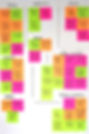
Interview Data and Affinity Mapping
I needed a way to visualize all the research I have gathered - so I created an affinity map to identify trends, insights, behaviors, and themes. It's helpful because we can further delve into more detailed questions in these areas in the next round of research.


User Personas
With all the information gathered to this point - it's time to create a user persona! A user persona is a fictional but realistic portrayal of our target user, I wanted to create someone who felt realistic and someone with whom I could design everything with her in mind.
Let’s meet Nicole, a 33-year-old Project Manager who lives in New York, NY. She's a career-driven mom who enjoys taking her family to random fun spots in NYC.

User Journey
To empathize with my user persona, ‘Nicole’ - I created a user journey to get a visual understanding of what a typical night out with a friend might look like for my persona to accomplish a goal. In the scenario below, Nicole went out with her friend for dinner - she needs to transfer funds from her bank to PlutoPay and then invite her friend to receive a reward bonus. She is going to use that credit to pay for a bit of the bill and add the cost of the dinner to her monthly budget. Below I have identified the actions, emotions, and thoughts of what my persona might encounter and possible opportunities to address these issues.


User Flow
I wanted to get a better understanding of my users' point of view, I created a user flow to think through the different decisions and paths they might take to complete a task. Creating user flows - helped in identifying what screens would be needed for each step that my user takes. I created three user flows that my persona Nicole will be using throughout her PlutoPay experience.

Card Sort
This is where I needed to get an idea of how the information architecture of PlutoPay would be. I started laying out the framework of the app by creating a preliminary sitemap and evaluating these ideas by conducting a hybrid card sort. I chose to use participants who were very familiar with digital payment services for this card sort. Participants were asked to first review a list of cards and then sort them into groups that made sense to them. The information gathered solidified how the sitemap would work for PlutoPay.

Information Architecture
After reviewing the hybrid card sort, and taking into consideration the similarity matrix and the dendrogram information - I organized the sitemap for PlutoPay. I wanted to have a way for users to learn what PlutoPay could offer them with a promotional page. After the user logged in, the new Homepage would give the user a more personalized experience.


Paper Sketches
After completing the sitemap, I began to design the main screens that I identified in my user flow by sketching low-fidelity wireframes. My main goal during this phase was to quickly sketch a couple of different solutions based on the research I gathered to this point. Using pencil and some graph paper - I quickly created and modified different layouts.
Below you can see paper sketches:

Balsamiq Mid-Fidelity Wireframes
After deciding the low-fidelity sketches looked good, I created a clickable mid-high fidelity prototype and started to add UI elements to each screen for usability testing to get user feedback on the user flows.

Adobe XD Mid-Fidelity Wireframes
I really wanted to explore Adobe XD around this time, so I decided to create more mid-fidelity wireframes to experiment with Adobe XD's usability testing features.

Mid-To-High Fidelity
After receiving feedback and revisions from the usability tests. I created the first version of a high-fidelity mockup. But I needed to run a preference test to confirm my insights and see how users would feel about both designs. The images on the right are what the final results turned into after performing the preference test.

Preference Testing
I wanted to run a preference test. I listened to my users and thought I could do better. Below is a sample of one of the screens that had to change for the better.

Evolution of the Home Screen

From Sketch to High Fidelity Wireframe
High Fidelity Wireframes


UI Kit
Designing the user interface was another fun thing for me to work on, I get so happily lost in Figma. Sometimes when you use apps on your phone, you fail to really absorb every detail with that app. But now - I find myself looking at every pixel to see how other designers figured out how to solve their specific problems. With this in mind I identified the PlutoPay brand by creating a UI KIT, which includes information such as the color palette, buttons, symbols, forms, tabs and more.

Usability Testing
Usability Script & Tests
I love this portion of UX Design, the testing phase! After creating a mid-fidelity clickable prototype. But, before I started testing my prototype, I created a usability test plan to use to see how users interact with the app and to define what objectives and goals I wanted to achieve by conducting a usability test.
The major goal of this study was to assess the learnability of new users interacting with the application for the first time. I observed and measured if users understand the app and if they can complete the main functions of the app, as well as how much time it took them to perform each task.
I have included the Usability Test Script, link.
Scenarios
After creating a plan of what I wanted to accomplish and how I was going to measure the results, I conducted a total of six moderated remote and in-person usability tests between June 9th and 12th. Five out of six participants used Zoom and a link to test the prototype via Adobe XD. Everything went very smoothly; no connectivity issues and tests were completed in under ten minutes. All participants were in the New York area and all have used multiple different digital payment services in the past.
I created four scenarios and tasks for users to test:
-
Scenario 1: You want to try out a new digital payment app that you have been hearing about. After the app is downloaded, you have to create an account, so you can explore the multiple features the app can offer.
-
Scenario 2: You are out to lunch with a friend, you need to send her $20 for the drinks that she has bought you, please send her the money.
-
Scenario 3: You have been researching and understanding more about cryptocurrency, and you want to use an app that allows you to send multiple different currencies to contacts. You want to buy Bitcoin because it’s one of the more popular currencies that you have been researching.
-
Scenario 4: Upon deciding that you enjoy using PlutoPay, you notice you can earn rewards by inviting your friends. Please copy a link to be able to share it with your friends.
Rainbow Speadsheet
I summarized the results from the usability test by using a rainbow spreadsheet. I separated each participant with a unique color and categorized what I observed during the interview based on observations, positive quotes, negative quotes, and errors. This helped to organize the information I gathered from the usability tests.


Summary
PlutoPay was my first UX case study with Career Foundry - I fell in love with the process. I learned so much, and a part of me wants to keep evolving PlutoPay. I am extremely happy with the outcome, and even sharing this project with my peers and friends has given me a huge confidence boost. I cannot wait to take on more projects in the future. I have a great idea for the next project I want to do. But for now - I will continue to read, listen, and watch all the best designers do their thing and continue my learning process.
Thank you so much for going through my PlutoPay Case study!
Thank you for reading!
If you have any feedback or want to chat with me, drop me a message at KBrackenUX@gmail.com or connect on LinkedIn.